Supplement Solutions
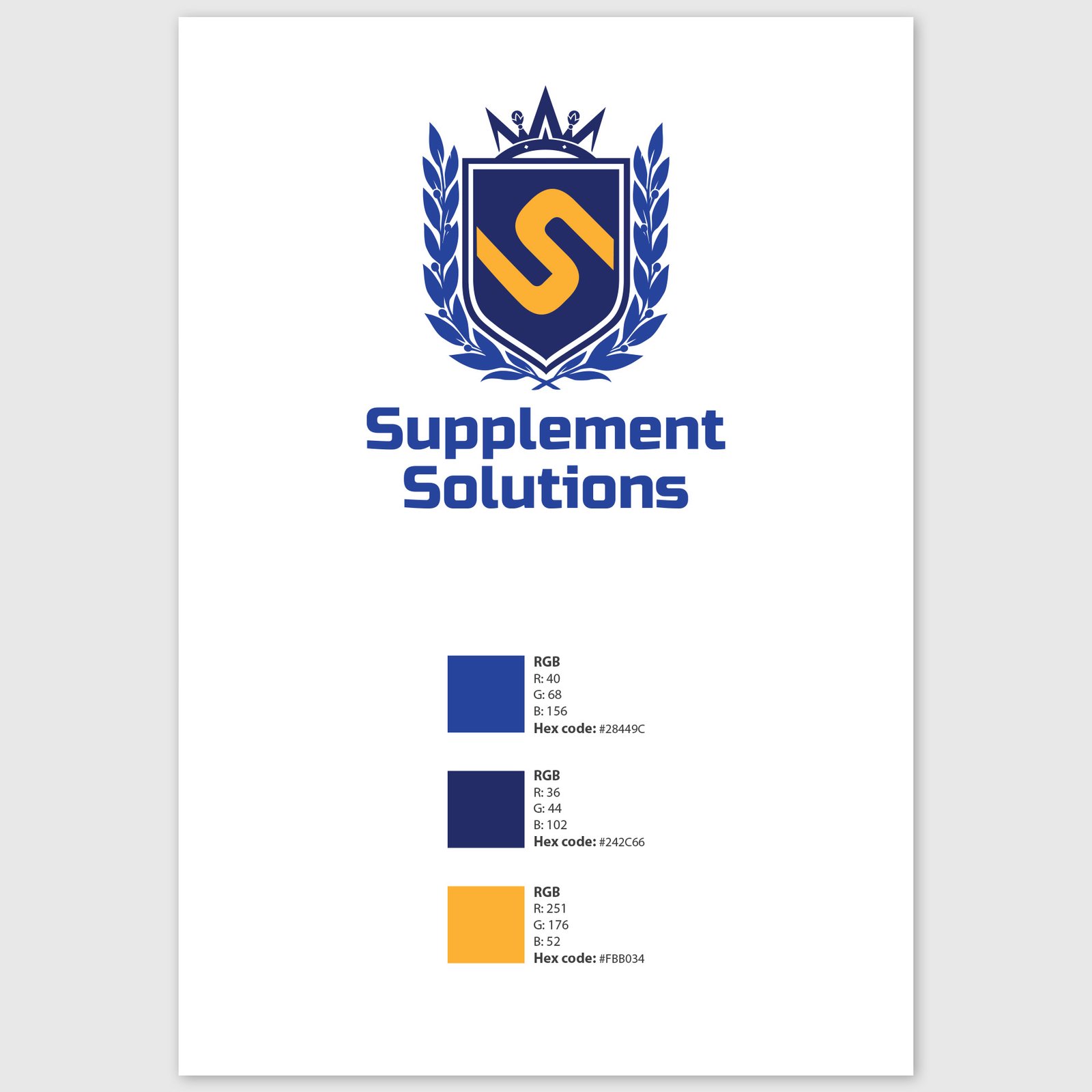
ProjectLogoYear2018CountryNew ZealandAboutDesigned for a supplement retailer focused on strength, energy and performance, this logo blends boldness with a sense of prestige. The shield and laurel crest bring a classic, trustworthy vibe—like a badge of honour—while the stylised “S” at the centre gives it a modern edge. I went with a strong blue to reflect confidence and stability, balanced by a pop of golden orange for energy and vitality. The typography is bold and athletic, helping the brand feel at home on both supplement labels and gym walls. Clean, confident and built to flex—this identity was made to power a brand that’s all about performance.Share

