Work in practice
HansaWorld website redesignRole and scope
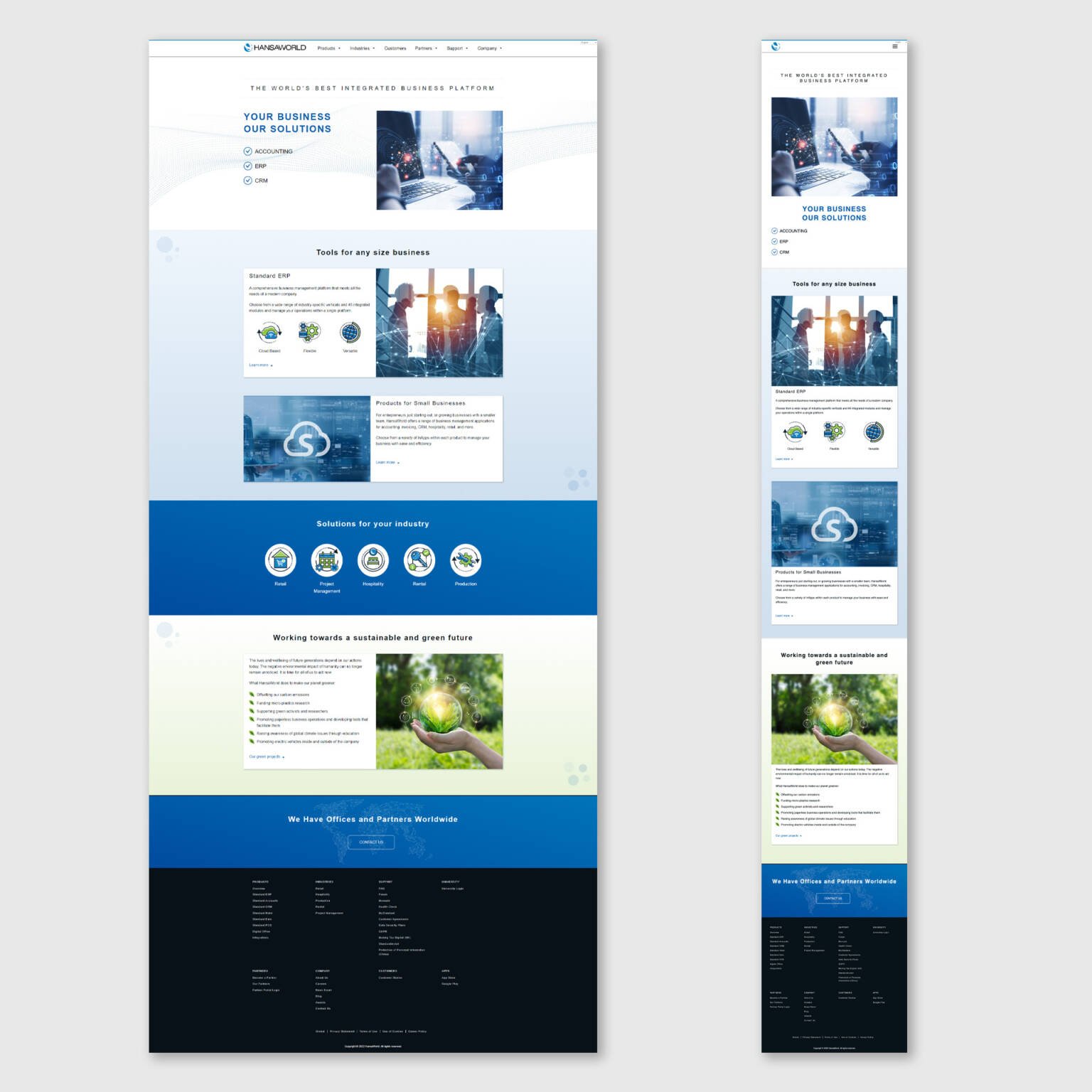
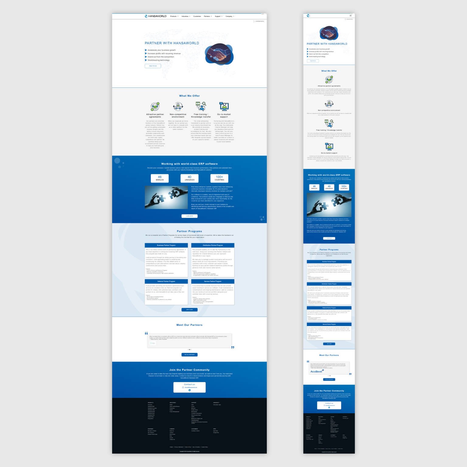
Lead designer from discovery to delivery. Partnership with marketing and subject experts. Scope covered the homepage, key product pages, pricing, resources, navigation, and the enquiry flow.
Problem
People were not finding the right content fast enough. Journeys looped, labels were unclear, and proof was scattered. The team needed a single story and a simpler path to enquiry.
Choices and approach
Research to structure Stakeholder interviews, analytics review, content audit. Defined primary audiences and top tasks. Wrote a clear information architecture and a short content strategy with one idea per section and a clear action.
Wireframes Low fidelity wireframes to test order and priority. Several rounds of working sessions to remove noise and confirm what matters.
Design High fidelity screens with a readable type scale, a tidy grid, and colour used to guide. Components named and documented for reuse.
Prototypes Clickable prototypes on desktop and mobile so the team could feel pace and hierarchy.
Testing Task based usability sessions to see how quickly people could reach product detail, pricing, and enquiry. Iterations on wording, hierarchy, spacing, proof placement, and button text.
Access and quality Colour contrast checked against guidelines, keyboard focus visible, touch targets sized for comfort. Image sizes optimised and libraries kept tidy in the CMS.
Result and impact
The new site tells one clear story and reduces effort on the path to enquiry. After launch, marketing reported stronger engagement, longer sessions on high value pages, and an uplift in qualified enquiries. Feedback from stakeholders noted better first impression and easier handover for future pages.
What I learned
Put the why and the next step at the start of each section.
Trimming the menu and merging look alike pages reduced loops in testing.
Simple headings and direct button text moved more people forward.
Placing testimonials and metrics beside the call to action lifted clicks.
They speed design now and keep the CMS build tidy for future updates.
Contrast, visible focus, and comfortable touch sizes make the difference.